


Let say, we need an image and text content. The text has to overlay on the image. If the text content grows, the image height should also increase. The most common way of doing this is putting the image as a background-image in CSS.
Similar to this
.banner  {
  background-image: url('path/to/img');
}
But what if this is the Hero banner of the page, and the business requirement is to use the image tag instead of CSS background-image for SEO and accessibility reasons.
For this purpose, we can achieve the text container by making it's position absolute and overlapped with the image. Similar to this
<div class="banner">
    <div class="banner-content">
        <h1>Lorem ipsum dolor sit amet, consectetur</h1>
    </div>
    <img class="banner-image" src="/path/to/img"/>
</div>
.banner {
  position: relative;
  width: 100%;
}
.banner-text {
  position: absolute;
  left: 50%;
  top: 50%;
  transform: translate(-50%, -50%);
}
.banner-image {
  width: 100%;
}
But what if the requirement is that if the banner content is growing, the image height should also increase and match the correct proportion. The above solution can't solve this requirement, because we set the banner-content has position: absolute, and its position outside the DOM tree structure.
For achieving the above point we can write code in javascript and set the height of the image tag.
How can we achieve this functionality without javascript?
Here is the way, we can achieve this by using CSS Grid functionality. It is a two-dimensional grid-based layout system. Grid is the very first CSS module created specifically to solve the layout problems we've all been hacking our way around for as long as we've been making websites.
In CSS Grid, we can give the
grid-areaandgrid-template-areas.grid-areagives an item a name so that it can be referenced by a template created with thegrid-template-areasproperty.
grid-template-areasdefines a grid template by referencing the names of the grid areas which are specified with the grid-area property. Repeating the name of a grid area causes the content to span those cells. The syntax itself provides a visualization of the structure of the grid.
Example:
header {
  grid-area: header;
}
main {
  grid-area: main;
}
aside {
  grid-area: aside;
}
footer {
  grid-area: footer;
}

body {
  display: grid;
  grid-template-columns: 100px 100px 100px;
  grid-template-rows: auto;
  grid-template-areas:
    "header header header"
    "main main aside"
    "footer footer footer";
}
In the above you can see the grid-template-columns have three 100px values, meaning it'll create a three-column layout. In grid-template-areas shows the page layout, header and footer take full width, main takes 2/3 width and aside takes 1/3 width.
Similar to this we can achieve the same in image and text overlapping.
Example:
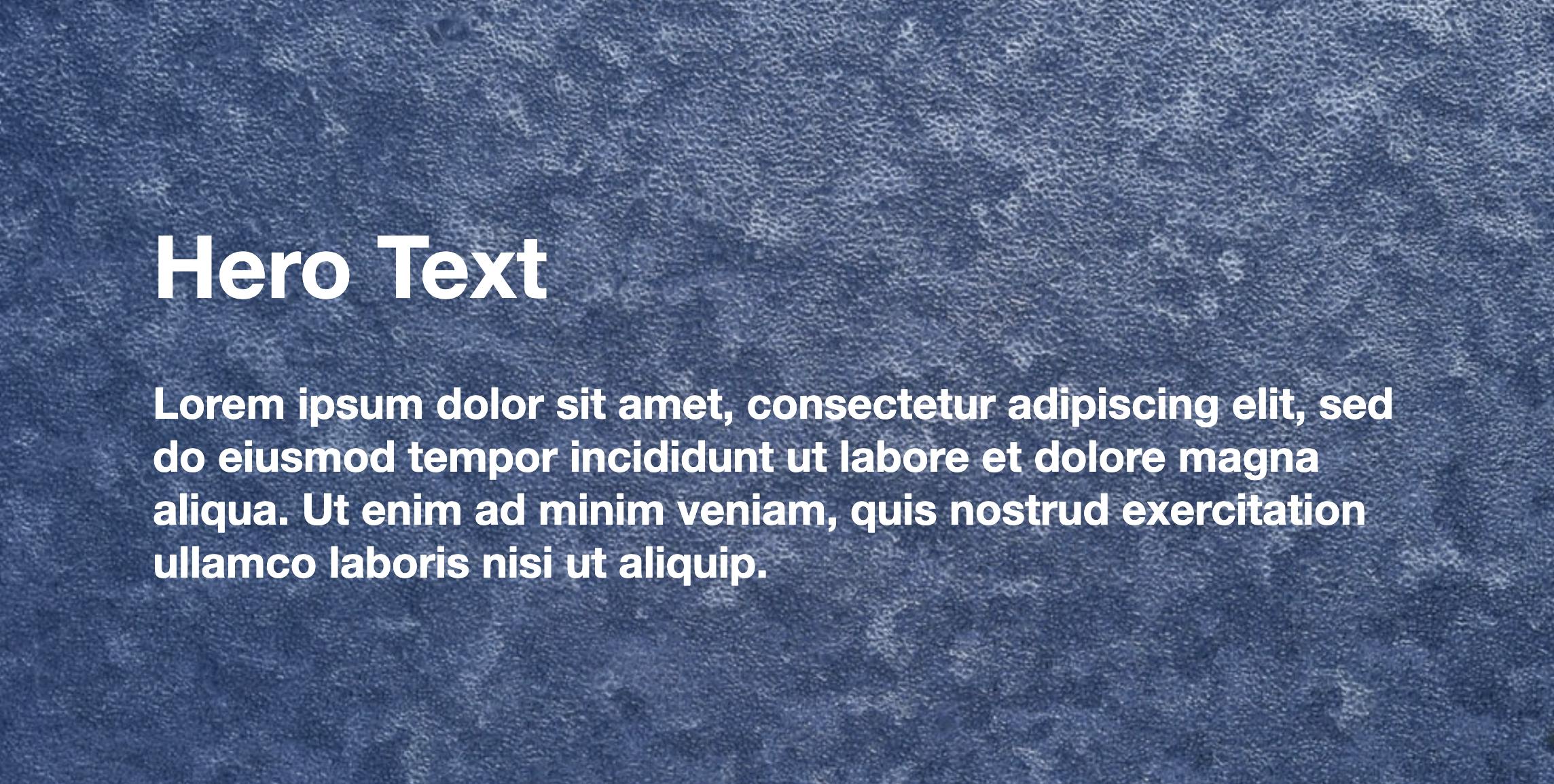
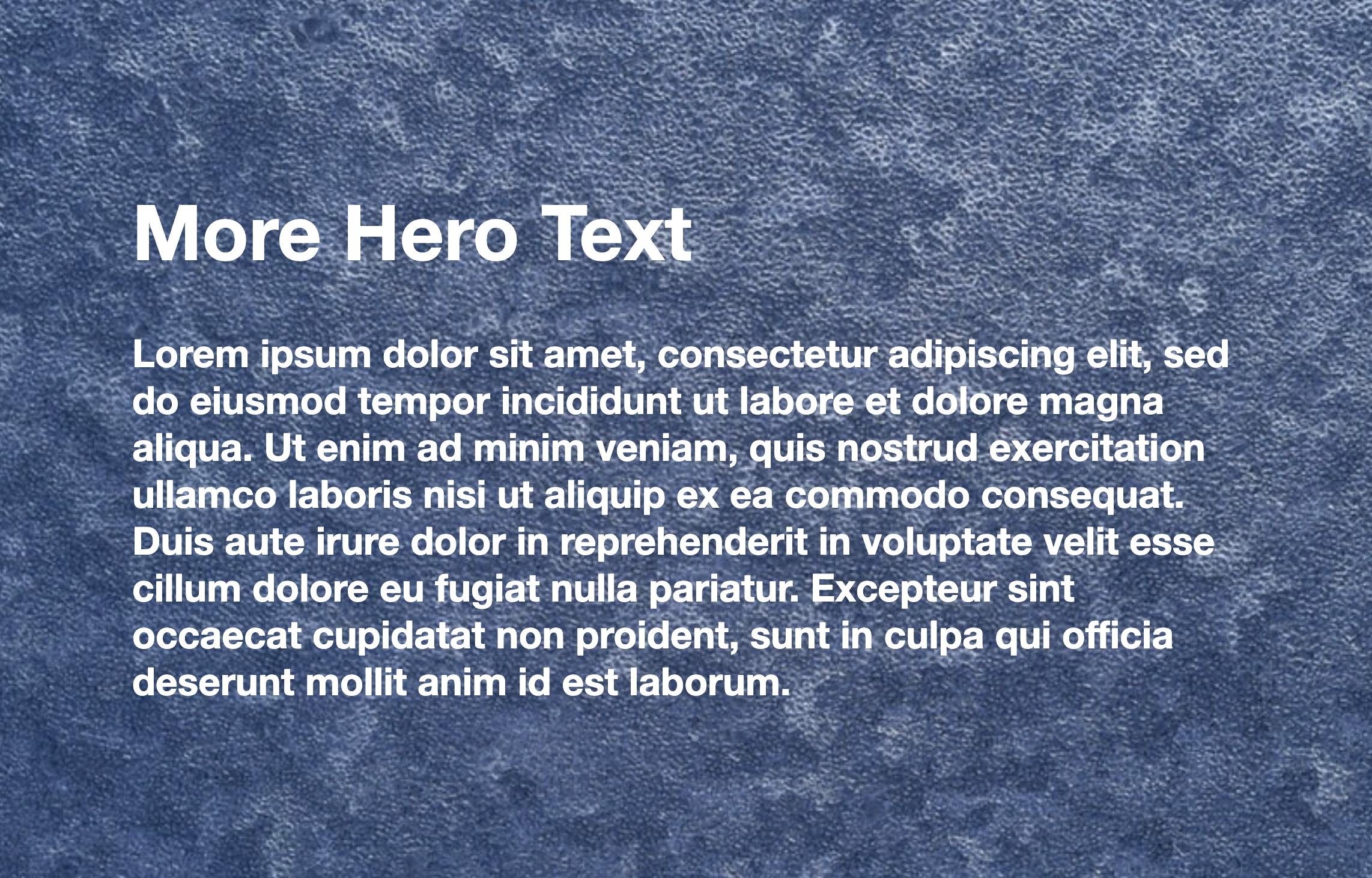
<div class="hero_container">
  <div class="hero_image">
    <img src="path/to/image">
  </div>
  <div class="hero_text">
    <h2>Hero Text</h2>
    <p>Lorem ipsum dolor sit</p>
  </div>
</div>
.hero_container {
  display: grid;
  grid-template-areas: "overlap-content";
}

img {
  width: 100%;
  height: 100%;
  object-fit: cover;
}

.hero_image {
  grid-area: overlap-content;
}

.hero_text {
  grid-area: overlap-content;
}
In the above example, the grid-template-areas value is a single name. The same name is used in both image and text. So, the content on each divs will overlap each other. We give image width and height 100%, so it'll occupy the full-screen width. For this overlapping, if the hero text content increases, the image height also increases as well.
Tada! 👋
Here we can achieve the dynamic height adjusting functionality on the image based on content using pure CSS, without javascript at all.
Here is the demo.
Thanks for reading.
Suggestions and comments are welcome 🙏